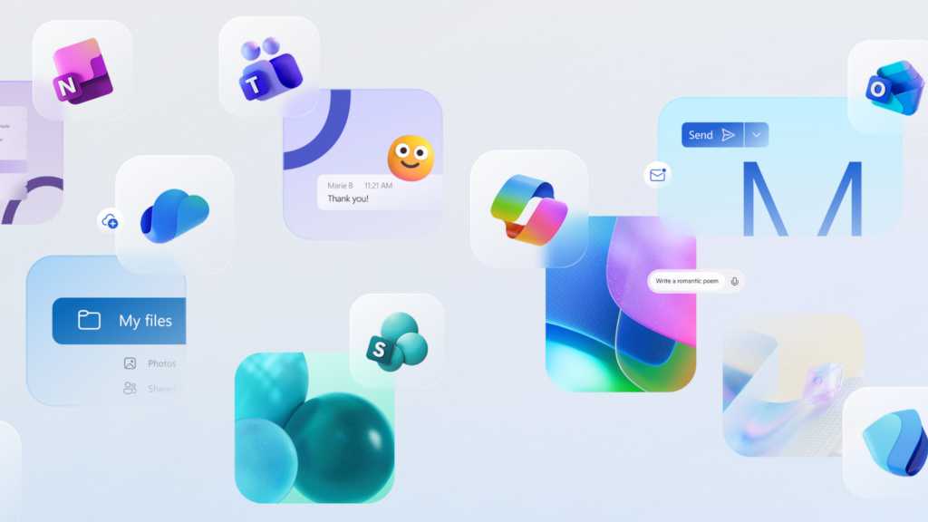
Microsoft has redesigned all the icons for its various Office applications (officially known as Microsoft 365 apps ), this time focusing on color gradients and contrasts. The result? These new Microsoft Office icons are now more colorful, more curvy, and more approachable.
We’ve known for some time that Microsoft Office apps were getting new icons (thanks to a leak). But they’re official as of today, according to Jon Friedman (CVP of Design and Research for Microsoft 365) in this Microsoft Design blog post .
Microsoft is rolling out the new design to users with immediate effect. In the post, Friedman explains the redesign’s significance:
When it comes to outsized impact, it’s hard to debate the almighty icon. No bigger than a postage stamp, these tiny symbols are gateways to entire

 PC World Business

 Fast Company Technology
 Fast Company Lifestyle
 TIME
TIME NBC 7 San Diego Entertainmet
 Reuters US Business
 Omak Okanogan County Chronicle
 PC World
 Bloomberg Law
 The Poughkeepsie Journal
 The Daily Beast