
 India Today
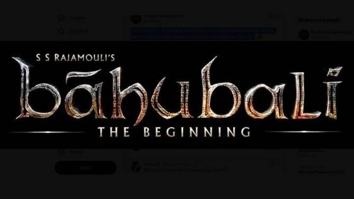
The mystery behind the unusual styling of 'Bahubali's title has finally been cleared up. After years of fan speculation, the film’s producer has responded to why the last letter, the L appears in uppercase while the rest of the title remains in lowercase.
According to the producer, the choice was purely to avoid visual confusion. The letters l and i placed together in lowercase can look nearly identical, especially in certain fonts. “To be honest, I forgot why we did this. So I asked Rajamouli and he said it was a design choice to balance the stroke on first "a" !,” the producer explained.
Take a look at the post:
The clarification has sparked a fresh wave of reactions online, with many appreciating director SS Rajamouli’s attention to detail. Some social media users even joked, “

 OK Magazine
 PBS NewsHour Politics
 MSNBC
MSNBC Raw Story
 WFMJ-TV Entertainment
 Chicago Tribune Politics
 The Conversation
 Crooks and Liars
 NFL Houston Texans