
 Essentiallysports
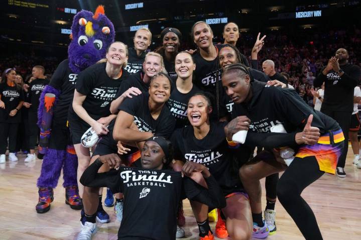
When the WNBA launched in 1997, it featured just eight teams, and the Phoenix Mercury was one of them. Naturally, s ince 1997, the league has gone through its share of ups and downs, and so has the Mercury. Also, it is one of those rare teams that has remained loyal to the city. But entering their third decade in the league, the franchise has finally decided it’s time for something new!
The most recognizable WNBA franchise – and a three-time champion – is officially modernizing its look. And the first step is already here with a brand-new logo reveal on Monday.
The primary logo features a stylized “M,” positioned at an angle of 19.97 degrees as a reference to the league’s inaugural season. It divides the rings into eight lines – a tribute to Mercury being one of the league’s eight ori

 NBA
NBA The Journal Gazette
 Orlando Sentinel Sports
 The Des Moines Register
 Arizona Daily Sun
 Rockford Register Star Sports
 Raw Story