
 Tom's Guide
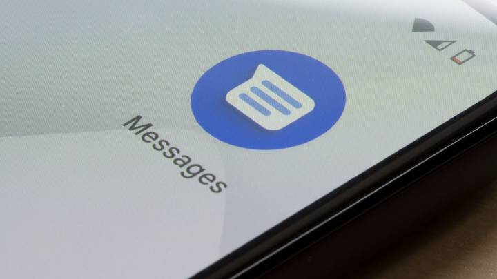
Google Messages has received some tweaks and changes over recent weeks, and now it's getting what could be the most significant adjustment: it now has the Material 3 Expressive design language on the main chat screen.
The main chat screen is where most users spend the most time while using the app, so before this update, it looked out of place compared to Android's latest design sensibilities.
Google used to offer colorful circles for Gallery, GIFs, Stickers, Magic Compse, Files and other functions in the Messages bar. Now, these have been dropped in favor of minimalistic pills. Based on the 9To5Google screenshots, the new icons exceed two rows (they are oblong instead of circular). I'm not sure I love having an extra row with only one icon in it, but it does look less cluttered overall.

 CNN
CNN The US Sun Technology
 1011 Now Sports
 Raw Story
 Fast Company Technology
 Jacksonville Daily Record
 SouthCoastToday
 Fast Company Lifestyle
 KTNV Channel 13 Las Vegas