
 NHL Montréal Canadiens
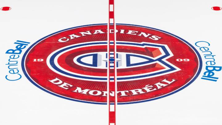
MONTREAL – Opponents at the Bell Centre will be seeing red from the moment the puck drops this season.
The Canadiens unveiled a new full-color, 3D-styled center-ice logo on Wednesday, featuring references to the team’s history and market.
The design sees the entire surface area of the central face-off circle filled in with red, replacing the single oversized Canadiens logo that had been in place since 2018.
Here’s a look at the other elements featured:
1909
The year the team was founded, referencing over 100 years of history while still keeping things new.
Canadiens de Montréal
The team’s official name in French, underscoring its unique NHL roots, and the official language of Quebec.
Embossed circle
Inspired by the overhead view of the Stanley Cup, 24 grooves along the edge refere

 Cover Media
 AlterNet
 Local News in California
 The Columbian Sports