
 Bored Panda
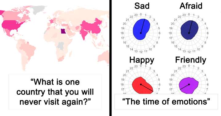
Visualization can be applied to pretty much any field; it helps to tell stories by curating data into a form that's easier to understand, highlighting any trends and outliers. And there's no place on the internet that is as obsessed with it as r/DataIsBeautiful.
The subreddit runs on a simple mission: to collect visualizations that effectively convey information. But the way its 16 million members go about it is anything but. There are no fake numbers, goofball statistics, and trivial analysis—just legitimate facts, portrayed in aesthetically pleasing ways. Such a delicate balance.
We at Bored Panda have already covered it once but when a community is that big, you know it's gonna keep delivering quality content so we just had to make an update. Enjoy! • You Might Also Like: 28 Side-By

 WFVX WVII News
 Pajiba
 KTLA Entertainment
 Washtington City Paper
 ABC 7 Chicago Entertainment
 Ocala Star-Banner
 VARIETY
 Essentiallysports Golf
 Nicki Swift
 Raw Story