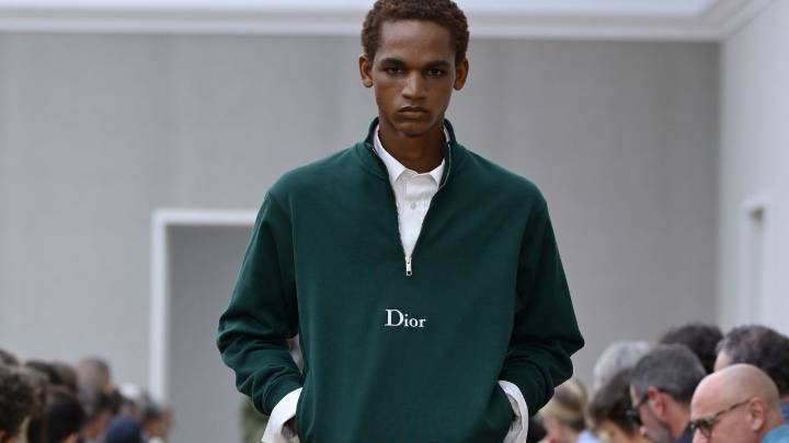
Jonathan Anderson , the recently appointed creative director of Dior, is already shaking up the label by doing away with the iconic all-capital DIOR logo, which the house has used since 2018. In its place comes a historic typography, a return to the mark chosen by Christian Dior in 1946: a capital “D” followed by oblique lowercase letters, derived from the Cochin font by engraver Charles-Nicolas Cochin. It may seem a small detail, but this gesture already marks the Northern Irish Anderson's desire to infuse his work with the heritage of the Avenue Montaigne house. For now, the logo change is limited to labels and textile details, and observers have seen a slight difference already in the men's spring-summer 2026 collection, the new artistic director's first runway show in the posit
Jonathan Anderson's New Dior Logo Is Actually Quite Old
 Vanity Fair2 hrs ago
125


 Lehigh Valley Live
 Women's Wear Daily Retail
 NBC News Video
 Local News in D.C.
 OK Magazine
 New York Post
 AlterNet
 The Daily Beast