
 The Verge
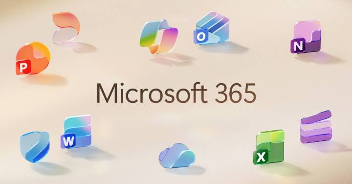
Microsoft is officially unveiling its new Office icons today, after they leaked earlier this year. The icons have a modern design that’s more colorful and playful, with subtle changes that match Microsoft’s recent work with its Fluent illustrations.
All of Microsoft’s 10 core Office icons are being refreshed, with a design that was inspired by Microsoft’s work on the Copilot icon. This is the first major change to the Office icons since their overhaul in 2018, and it’s meant to represent a more connected design system and Copilot’s influence on Microsoft 365.
“The core 10 Office apps were last updated in 2018 and the way we described what the designs represented is almost identical to language used today: connection, coherence, seamless collaboration, fluid transitions,” explains Jon Fri

 America News
 PC World
 Fast Company Technology
 NBC News
 Cleveland Jewish News
 KSL NewsRadio
 CNN Business
 Nola Sports