
 Lifehacker
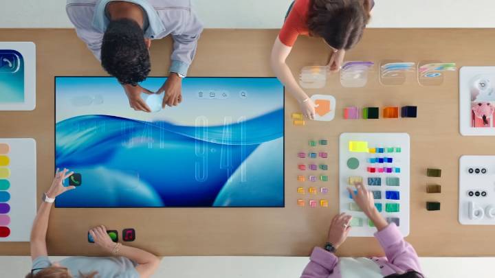
For better or worse, nothing defines iOS 26 quite so much as Liquid Glass. Apple's distinct new design language has been met with praise and criticism, with some users enjoying the refreshed look, and others bemoaning the UI's issues with visibility and consistency.
It seems Apple was similarly of two minds on the update, having toyed around with the exact look of Liquid Glass throughout the iOS 26 beta testing period. The company seemed to be having trouble settling on a specific balance between the design's glassy effect, which can look really cool, and its overall readability. If buttons are too clear, for example, they'll let in more of the background elements, which can make it more difficult to see them. But by reducing the glass effect too much by adding a tint to the icon and menu

 TechCrunch
 The Verge
 WCCFTECH News
 Deadline
 CNN
CNN NBC News
 Reuters US Business
 23ABC News Bakersfield
 KLKN-TV Lancaster County
 AlterNet
 Raw Story
 FOX News