
 Ars Technica
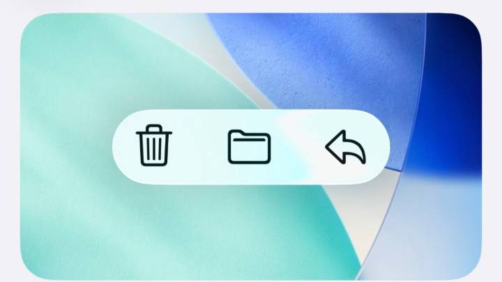
Apple’s new Liquid Glass user interface design was one of the most noticeable and divisive features of its major software updates this year. It added additional fluidity and translucency throughout iOS, iPadOS, macOS, and Apple’s other operating systems, and as we noted in our reviews , the default settings weren’t always great for readability.
The upcoming 26.1 update for all of those OSes is taking a step toward addressing some of the complaints, though not by changing things about the default look of Liquid Glass. Rather, the update is adding a new toggle that will let users choose between a Clear and Tinted look for Liquid Glass, with Clear representing the default look and Tinted cranking up the opacity and contrast.
The default glassy look of the notifications in iOS 26. The de

 TechCrunch
 Fast Company
 Lifehacker
 CNN Business
 Associated Press US News
 Catholic News Agency
 KLCC
KLCC Edmonton Sun World
 TIME
TIME NBC Southern California
 Tom's Guide
 Deadline Business
 Tucson News Now
 Raw Story