
 The Conversation
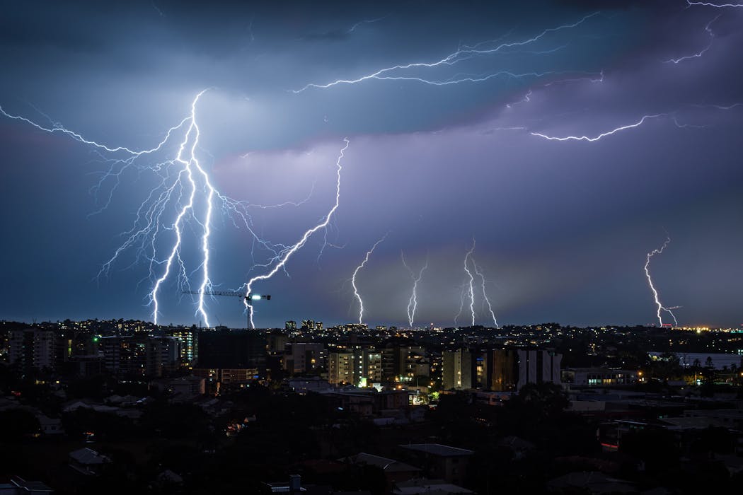
Every day, almost 2 million Australians visit the Bureau of Meteorology website for weather information. The data gathered and processed by the government agency’s radars, weather stations and supercomputers are converted into short and medium-term forecasts essential for farmers, rural residents, professional and recreational fishers, pilots, emergency services and more. Farmers make decisions on whether to plant crops based on forecasts, while emergency services may boost response capacity ahead of wild weather.
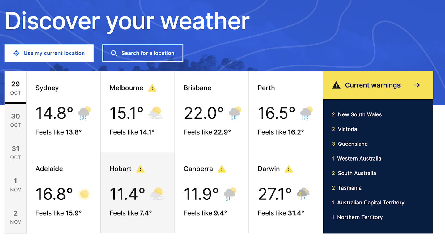
Unfortunately, a controversial website redesign has brought this essential service under scrutiny. Last Wednesday, the bureau’s website switched to a fresh, modern look as part of a $A4 million program – the first major update since 2013. The former website – which is still accessible – had served Australia well, but was looking dated. Bureau staff, government agencies and key user groups had been calling for improvements for some time.
The problem was, the new website was less accessible. Vital data was hard to find or had changed format as the summer storm season loomed. On social media, the backlash was sudden and severe. Angry callers filled the bureau’s feedback lines. Media articles began appearing. Anger boiled over after severe storms hit Brisbane and Melbourne on Monday.
Many website users felt the bureau’s new design did not show its real severity. Queensland Premier David Crisafulli claimed the timing of the launch placed lives at risk.
Bureau management initially defended the updated site. But the federal government has now asked the bureau to fix the issues. Environment Minister Murray Watt said it was “clear that the new BOM website is not meeting many users’ expectations”.
So what went wrong? And are the criticisms warranted?
Major changes, poorly timed
When a public service makes major changes, regular users have to understand the changes and be able to access what they need.
Here, the bureau erred. Launching a major update at the start of the spring storm season and during a record-breaking heatwave was not ideal. Better public communication and walk-throughs could have helped make these changes easier.
But the problems ran deeper than timing, as the criticism from farmers, emergency services and even some professional meteorologists indicates.
All point to significant problems with the website’s usability and navigation, radar functionality and accuracy and wider design and launch issues.
Radar problems
The updated rain radar functionality has come in for particular criticism. On the previous website, users could see the path a storm or weather front had taken and see the time it was likely to arrive. This function was especially useful for emergency services. But this was removed. Other users have noted a lag time for the new radar – a storm could arrive before the bureau website suggested it would.
The new radar site also changed the colour scale used to show the severity of a storm. This revision meant users could underestimate storm severity.
The old Bureau site rain radar used dbz (radar reflectivity units). But the new one has switched to a new unit, mm/h (rainfall rate in millimetres). It’s still possible to switch back to the more familiar dbz, but for many users, it won’t be clear how to do this.
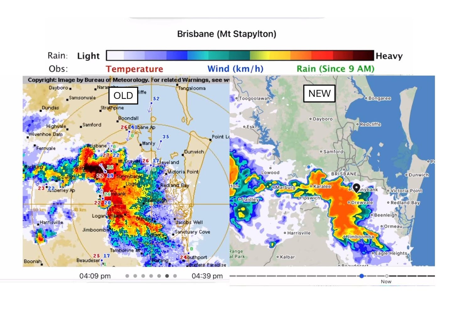
As the bureau moves to fix these issues, it would make sense to make the old and new colour scales the same, as independent meteorologists have suggested. That is, the black colour showing highest intensity rainfall using the old dbz units should be tied to the highest rate for the mm/h units.
That’s not all. Farmers and fishers have been frustrated by the disappearance of the Doppler wind function. On the old site, this function was a vital way to track the intensity of winds associated with supercell storms, cold fronts and tropical cyclones.
In hilly regions such as the area between Cooktown and Townsville, local weather radars are essential as a way to give residents and farmers a better way to see rainfall. But in the new update, some areas appear to have been completely wiped from the radar view. Places such as Cape Tribulation – one of the wettest locations in Australia – can no longer access this crucial information.
It’s essential Australians have a reliable and understandable source of weather information before summer begins. This summer, Australia is likely to experience a La Niña event, which tend to bring cooler, rainier conditions as well as a higher risk of more tropical cyclones in Australian longitudes and a more active monsoon season across the tropics. Both of these will increase the risk of flooding across Australia’s north and east.
To their credit, the bureau’s management have requested constructive feedback on the new website. Giving clear feedback on what works and what doesn’t will be useful in fixing these issues and restoring confidence in Australia’s weather information.
In the interim, users can still access the old version of the website.
This article is republished from The Conversation, a nonprofit, independent news organization bringing you facts and trustworthy analysis to help you make sense of our complex world. It was written by: Steve Turton, CQUniversity Australia
Read more:
- Let’s celebrate nature’s spookiest and freakiest animals this Halloween
- Climate change is a crisis of intergenerational justice. It’s not too late to make it right
- ‘Minimalist’ lifestyles may not effectively tackle overconsumption. Can performance management help?
Steve Turton has received funding from the Australian and Queensland Governments.

 Associated Press Top News
 America News
 AP Breaking News
 Associated Press US and World News Video
 FOX 5 Atlanta Crime
 KLCC
KLCC Essentiallysports Olympics