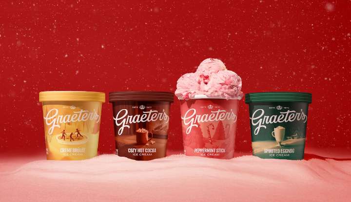
CINCINNATI, Ohio — Graeter’s Ice Cream fans can look for new packaging in the freezer case.
Shoppers will see that the signature maroon color returns to prominence, complemented by elegant patterns and a new crown icon symbolizing both Cincinnati—the Queen City—and the company’s “royalty” in the world of ice cream, explained the company in a statement.
“We’ve always believed that being the ‘Graetest’ means doing things our way – the right way – even when shortcuts exist,” said Richard Graeter, fourth-generation president and CEO, in a press release.
“Our rebrand honors everything in our past while confidently looking ahead to the next generation of ice cream lovers.”
The familiar cursive logo remains but has been polished for modern use, paired with a new tagline: “Taste the Graetest

 cleveland.com

 WCPO 9
 Cleveland 19 News Crime
 Cleveland Jewish News
 WFMJ-TV
 The Hill
 The Fashion Spot
 Major League Soccer
 TIME
TIME