
 Bored Panda
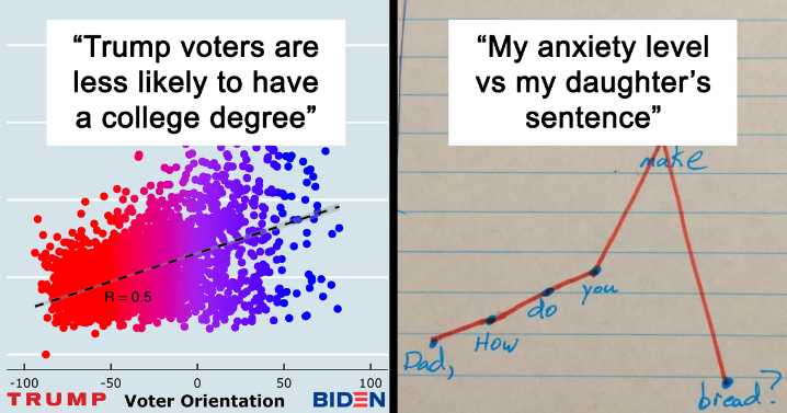
Data is beautiful—and I’m in love. I swear it’s not just because of its gorgeous pie charts, voluptuous curves, and stunning axes... Promise! When it comes to showing off just how stunningly data can be presented, there’s no better to place to feast your eyes than the ‘Data is Beautiful’ subreddit that hosts a massive community of over 15.6 million people and which celebrated its 9th birthday in February.
The community is full of math, statistics, and art lovers, as well as professionals who use data every day. Often, they get so inspired by the eye-pleasing charts and graphs, they create their own and end up on the front page of Reddit.
We’ve collected some of the most aesthetic expressions of data found on r/DataIsBeautiful for you to enjoy, so scroll on down and have a peek, dear Pand

 America News
 The Cut
 The Hollywood Reporter Movies
 NewsTalk 1280
 WOWT
WOWT Orlando Sentinel Politics
 New York Post Video
 IMDb TV